Manage Report Outlines
Required Tenable Security Center User Role: Organizational user with appropriate permissions. For more information, see User Roles.
In Tenable Security Center, the report outline allows you to modify the structure of a PDF or template-based report.
The outline consists of the following components:
| Component | Outline Level | Description |
|---|---|---|
| chapter | primary | Highest-level component. Can contain any type of element (grouping, text, chart). |
| element | subordinate | A grouping, text, or chart element. Can be nested in a chapter or grouping component. |
Edit a Report Outline
To edit a report outline:
-
In the left navigation, click Reporting > Reports.
The Reports page appears.
-
In the reports table, click the name of the report you want to edit.
-or-
Right-click the row for the report you want to edit, and click Edit.
The Edit Report page appears.
-
On the left side of the page, click Definition.
The report outline appears. The outline is, by default, expanded.
-
In the report outline, you can:
- Expand or collapse elements nested in the outline by clicking Collapse All or Expand All at the top of the outline.
- Expand or collapse elements nested in an individual chapter or element by clicking the arrow next to the element.
- Add a custom chapter.
- Add a template chapter.
- Add or edit a report element.
- Reorder chapters and elements in a report.
-
Delete a report element by clicking the delete icon next to the element.
Note: Tenable Security Center does not ask you to confirm this deletion. However, the deletion is not final until you save all changes to the report.
- Click Submit to save your changes to the report.
Add a Custom Chapter to a Report
In Tenable Security Center, you can add custom chapters to PDF or template-based reports.
To add a custom chapter to a report definition:
-
In the left navigation, click Reporting > Reports.
The Reports page appears.
-
In the reports table, click the name of the report you want to edit.
-or-
Right-click the row for the report you want to edit, and click Edit.
The Edit Report page appears.
-
On the left side of the page, click Definition.
The report outline appears. This outline is, by default, expanded. For more information, see Edit a Report Outline.
-
At the bottom of the report outline, click Add Chapter
Tip: If the report contains multiple chapters or sections, scroll down to locate the bottom navigation bar. It can also be helpful to click Collapse All on the top navigation bar to collapse the outline to its highest-level components.
The Add Chapter page appears.
-
In the Name box, enter a title for the chapter.
-
In the Location box, select a relative location for the chapter within the report.
-
In the Style box, select a style for the report.
-
Click Submit.
Tenable Security Center adds the chapter to the report and displays the Edit Report page.
-
Click Submit to save your changes to the report.
Add a Template Chapter to a Report
In Tenable Security Center, you can add template chapters to template reports and custom PDF reports.
To add a template-based chapter to a report definition:
-
In the left navigation, click Reporting > Reports.
The Reports page appears.
-
In the reports table, click the name of the report you want to edit.
-or-
Right-click the row for the report you want to edit, and click Edit.
The Edit Report page appears.
-
On the left side of the page, click Definition.
The report outline appears. This outline is, by default, expanded. For more information, see Edit a Report Outline.
-
At the bottom of the outline, click Add Template Chapter.
-
Do one of the following:
-
In the Search Templates box in the top right corner of the page, search for a specific template by keyword.
Tip: After the initial search, you can limit search results by template category.
-
Click a template category icon to view the related templates.
-
-
Click the report template that contains chapters you want to include in your custom report.
-
(Optional) Modify the default options for the report template:
-
In the Chapters section, select which chapters from the template you want to include in your report. By default, the report includes all chapters from the template.
-
Do one of the following:
-
In the Focus section, target all systems in the report.
This is the default setting. To return to this setting, click All Systems in the Targets drop-down box.
-
Target specific assets in the report.
-
In the Targets drop-down box, click Assets.
-
Select Assets and Repositories.
-
-
Target specific IP addresses in the report.
-
In the Targets drop-down box, click IP Addresses.
-
In the IP Addresses box, type the IP address or addresses where you want the report to focus. Use commas to separate multiple addresses.
-
In the Repositories box, select a target repository or repositories.
-
-
Target specific repositories in the report.
-
In the Targets drop-down box, click Repositories.
-
In the Repositories box, select a target repository or repositories.
-
-
-
(Optional) Edit text in the Description box.
Note: You cannot modify any information in the Details section.
-
-
Click Add.
Tenable Security Center adds the template chapter or chapters to your custom report and displays the Add Report page again.
-
(Optional) Change the template chapter options.
-
Click the edit icon next to the chapter you added.
-
In the Name box, edit the chapter title.
-
In the Location box, change the relative location for the chapter within the report.
-
In the Style box, select a style for the chapter.
-
Click Submit to save your changes to the chapter.
-
-
Click Submit to save your changes to the report.
Add or Edit a Report Element
You can add or edit elements within chapters or grouping elements in Tenable Security Center reports.
To add or edit a report element:
-
In the left navigation, click Reporting > Reports.
The Reports page appears.
-
In the reports table, click the name of the report you want to edit.
-or-
Right-click the row for the report you want to edit, and click Edit.
The Edit Report page appears.
-
On the left side of the page, click Definition.
The report outline appears. This outline is, by default, expanded. For more information, see Edit a Report Outline.
-
Do one of the following:
-
Click Add Element next to the element where you want to add the element.
-
Click the edit icon next to the element you want to change.
Tip: To display Add Element or the edit icon, hover the cursor over the element.
-
-
Configure any of the following types of elements:
-
Click Submit to save your changes to the report.
Configure a Grouping Element in a Report
Grouping elements in Tenable Security Centerreports include:
|
Type |
Description |
Relevant Reports |
|---|---|---|
|
Group |
Groups associated elements on the same page. |
|
|
Section |
Allows you to organize content within chapters. |
|
|
Iterator |
Allows you to specify how the report groups its data. For example, if an Iterator Type of Port Summary is chosen for a vulnerability report, vulnerability data in the report is grouped by detected ports. If you do not configure an iterator, hosts and vulnerabilities are listed in the report individually. |
To configure a grouping element:
-
In the left navigation, click Reporting > Reports.
The Reports page appears.
-
In the reports table, click the name of the report you want to edit.
-or-
Right-click the row for the report you want to edit, and click Edit.
The Edit Report page appears.
-
On the left side of the page, click Definition.
The report outline appears. This outline is, by default, expanded. For more information, see Edit a Report Outline.
-
Click Add Element.
Tip: To display Add Element, hover the cursor over the element.
- Do one of the following:
Add a group to the report.
In the Grouping section, click the Group icon.
Configure the following options:
Option Action Name Type a name for the element. Location Select a location for the element in the report. Style Select a style for the element.
Add a section to the report.
- In the Grouping section, click the Section icon.
Configure the following options:
Option Action Name Type a name for the element. Location Select a location for the element in the report. Style Select a style for the element.
Add an iterator to the report.
- In the Grouping section, click the Iterator icon.
Configure the following options:
Option Action General Name Type a name for the element. Location Select a location for the element in the report. Style Select a style for the element. Definition Query Select a predefined query to define the data included in the element. For more information, see Queries.
Type Select the type of data to include in the element. Iterator elements support vulnerability or event data only.
Source Select the source of the data included in the element.
Valid values for this field differ based on the setting of the Type option:
- If Type is set to Vulnerability, valid Source values are:
- Cumulative—All vulnerabilities, regardless of whether the vulnerabilities have been remediated or not
- MItigated—Remediated vulnerabilities
Individual Scan—Vulnerabilities identified in a specific scan
Note: If you select Individual Scan, Tenable Security Center displays the Selected Scan option, which allows you to select a scan to use as the basis of the report:
Click one of the predefined date ranges, or click Custom Range and enter starting and ending days for the range.
Click Fetch Scans to view a list of possible scans within the date range.
Click the scan you want to use in the drop-down box.
Filters Specify additional criteria to refine element data. See Manage Report Filters
Iterator Type Select a grouping method for iteration data:
- IP Summary—Group vulnerability or event data by the IP addresses of detected hosts.
- Port Summary—Group vulnerability or event data by the detected ports.
- Type Summary—Group event data by event type.
- User Summary—Group event data by user.
- Vulnerability Summary—Group vulnerability data by individual vulnerability.
Results Displayed Select the number of results you want to include in the iteration. Sort Column Select the column that Tenable Security Center uses to sort the iteration data. Sort Direction Select the sort direction for the iteration data. Header Information Select the columns you want to include in the iteration data. Available columns depend on the settings of the Type and Source options. - If Type is set to Vulnerability, valid Source values are:
- Click Submit to save the element.
- Click Submit to save your changes to the report.
Configure a Text Element in a Report
Text elements in Tenable Security Center reports include:
|
Type |
Description |
Relevant Reports |
|---|---|---|
|
Matrix |
Data in a chart layout. |
|
|
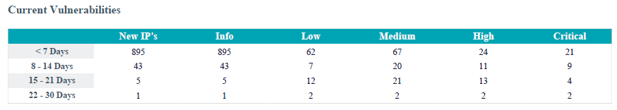
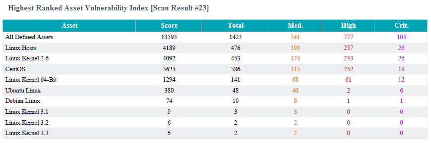
Table |
Data in a table layout (max results displayed: 999). The underlying data set determines the report display. The default view for most reports is host-centric and Tenable Security Center presents the user with the ability to choose a vulnerability-centric report (a listing of vulnerabilities with all associated hosts). |
|
|
Paragraph |
Descriptive text that can be inserted anywhere in the report. Use this option to describe table elements or report output for the viewer. |
|
|
Assurance Report Card |
An element based on the results of a selected Assurance Report Card. |
To configure a text element in a report:
-
In the left navigation, click Reporting > Reports.
The Reports page appears.
-
In the reports table, click the name of the report you want to edit.
-or-
Right-click the row for the report you want to edit, and click Edit.
The Edit Report page appears.
-
On the left side of the page, click Definition.
The report outline appears. This outline is, by default, expanded. For more information, see Edit a Report Outline.
-
Do one of the following:
-
Click Add Element to add an element.
-
Click the edit icon next to the element to edit an existing element.
Tip: To display Add Element and the edit icon, hover the cursor over the element.
-
-
Do one of the following:
-
Add a paragraph to the report.
- In the Text section, click the Paragraph icon.
-
Configure the following options:
Option Action Name Type a name for the element. Location Select a location for the element in the report. Style Select a style for the element. Text Type the text of the paragraph. - Click Submit to save your changes to the element.
-
Add an Assurance Report Card to the report.
- In the Text section, click the Assurance Report Card icon.
-
Configure the following options:
Option Action Name Type a name for the element. Location Select a location for the element in the report. Style Select a style for the element. Assurance Report Card Select the Assurance Report Card (ARC) you want to add to the report. For more information on ARCs, see Assurance Report Cards. - Click Submit to save your changes to the element.
-
Click Submit to save your changes to the report.
Configure a Matrix Element in a Report
A matrix element is a type of text element you can insert into a Tenable Security Center report definition. For more information on text elements, see Configure a Text Element in a Report.
To configure a matrix element in a report:
-
In the left navigation, click Reporting > Reports.
The Reports page appears.
-
In the reports table, click the name of the report you want to edit.
-or-
Right-click the row for the report you want to edit, and click Edit.
The Edit Report page appears.
-
On the left side of the page, click Definition.
The report outline appears. This outline is, by default, expanded. For more information, see Edit a Report Outline.
- Do one of the following:
Add a new element:
- Click Add Element.
- In the Text section, click the Matrix icon.
Click the edit icon next to the element you want to change.
Tip: To display Add Element and the edit icon next to an element, hover the cursor over the element.
-
Configure the General options:
Option Action Name Type a name for the element. Location Select a location for the element in the report. Style Select a style for the element. -
In the Cells section, select the number of columns and rows you want the matrix to include. By default, the matrix is 4 cells by 4 cells.
-
Click Generate Cells.
Tenable Security Center displays the empty matrix for configuration.
- Do one of the following:
Edit a row or column header.
Click the header for the row or column you want to edit.
Next to the header label, click the
 menu.
menu.The actions menu appears.
Click Edit Header.
In the Label box, type a new header.
Click Submit.
Add a matrix component.
- Click the matrix cell where you want to add the component.
In the Data Type drop-down box, select the type of data for the component.
In the Type drop-down box, select the type of calculation you want the component to perform.
In the Source drop-down box, select a data source.
(Optional) In the Filter box, add or edit a filter using the same steps you would to add a filter to a report element; see Manage Filter Components for a Single Element in a Chapter Report.
In the Rules section, click Add Rule to add a rule.
-or-
Click the edit icon next to a rule to edit an existing rule.
- Click Submit to save your changes to the component.
Copy a row or column.
Click the header for the row or column you want to copy.
Next to the header label, click the
menu.The actions menu appears.
Click Copy.
For columns, Tenable Security Center inserts the copied column to the right of the original column
For rows, Tenable Security Center inserts the copied row under the original row.
Delete a row or column.
Click the header for the row or column you want to delete.
Next to the header label, click the
menu.The actions menu appears.
Click Delete Cells.
-
Click Submit to save your changes to the element.
- Click Submit to save your changes to the report.
Example
Configure a Table Element in a Report
A table element is a type of text element you can insert into a Tenable Security Center report definition. For more information on text elements, see Configure a Text Element in a Report.
To configure a table element in a report:
-
In the left navigation, click Reporting > Reports.
The Reports page appears.
-
In the reports table, click the name of the report you want to edit.
-or-
Right-click the row for the report you want to edit, and click Edit.
The Edit Report page appears.
-
On the left side of the page, click Definition.
The report outline appears. This outline is, by default, expanded. For more information, see Edit a Report Outline.
-
Do one of the following:
-
Add a new element.
-
Click Add Element.
-
In the Text section, click the Table icon.
-
-
Click the edit icon next to the element you want to change.
Tip: To display Add Element and the edit icon next to an element, hover the cursor over the element.
-
-
Configure the General options:
Option Action Name Type a name for the element. Location Select a location for the element in the report. Style Select a style for the element. -
Configure the Data options:
Option Description Type Equivalent to the Definition option of the same name in Report Options. Query Source Tool Filters -
Configure the Display options:
Option Description Results Displayed Equivalent to the Display option of the same name in Report Options. Sort Column Sort Direction Display Columns -
Click Submit to save your changes to the element.
-
Click Submit to save your changes to the report.
Example
Configure a Charts Element in a Report
Charts elements in Tenable Security Center reports include:
|
Option |
Description |
Relevant Reports |
|---|---|---|
|
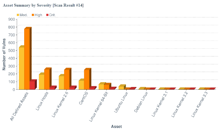
Bar Chart |
Click to add a bar chart element to the report.
|
|
|
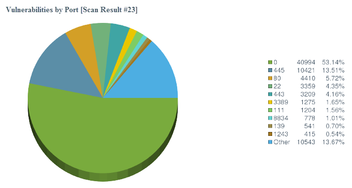
Pie Chart |
Click to add a pie chart element to the report.
|
|
|
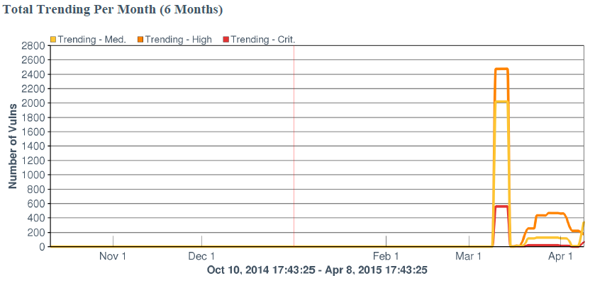
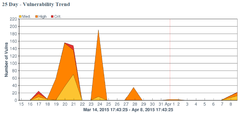
Line Chart |
Click to add a line chart element to the report.
Line charts are defined by time (x-axis) and series data (y-axis). When selecting the time, available options include Relative time and Absolute time. One or more series data elements can be chosen and displayed as discrete lines for easy comparison. |
|
|
Area Chart |
Click to add an area chart element to the report.
Area charts are defined by time (x-axis) and series data (y-axis). When selecting the time, available options include Relative time and Absolute time. One or more series data elements can be chosen and displayed as a stackable view for easy comparison. |
To configure a chart element in a report:
-
In the left navigation, click Reporting > Reports.
The Reports page appears.
-
In the reports table, click the name of the report you want to edit.
-or-
Right-click the row for the report you want to edit, and click Edit.
The Edit Report page appears.
-
On the left side of the page, click Definition.
The report outline appears. This outline is, by default, expanded. For more information, see Edit a Report Outline.
- Do one of the following:
Add a chart element:
- Click Add Element to add an element.
- In the Charts section, click the icon for the type of chart you want to add.
Click the edit icon next to an existing chart element.
Tip: To display Add Element and the edit icon, hover the cursor over the element.
-
For all charts, configure the General options:
Option Action Name Type a name for the element. Location Select a location for the element in the report. Style Select a style for the element. -
For bar charts and pie charts, configure the following Data options:
Option Action Type Equivalent to the option the Definition option of the same name in Report Options. Query Source Tool Filters -
For line charts and area charts, configure the following Data options:
Option Action Data Type Valid values are Relative and Absolute. Use to configure the x-axis of the chart. Data Range Use to configure the x-axis of the chart:
- If you select Relative for Data Type, select a relative date range.
- If you select Absolute for Data Type, select a specific start and end date for the data.
Series Use to configure the y-axis of the chart. Line charts and area charts require that you configure at least one series. -
For bar charts and pie charts, configure the following Display options:
Option Action Results Displayed Equivalent to the Display option of the same name in Report Options. Sort Column Sort Direction Display Columns -
Click Submit to save your changes to the element.
- Click Submit to save your changes to the report.
Reorder Report Chapters and Elements
In Tenable Security Center, you can reorder chapters and elements in a PDF, CSV, or template-based report.
To reorder report chapters and elements:
-
In the left navigation, click Reporting > Reports.
The Reports page appears.
-
In the reports table, click the name of the report you want to edit.
-or-
Right-click the row for the report you want to edit, and click Edit.
The Edit Report page appears.
-
On the left side of the page, click Definition.
The report outline appears. This outline is, by default, expanded. For more information, see Edit a Report Outline.
-
Do one of the following:
-
In the report outline, click the report element, then drag and drop it to its new location.
-
Click the edit icon for the component, and select a new location in the Location drop-down box.
-
-
Click Submit to save your changes to the report.